


I cannot emphasize enough how important the intranet homepage design is to the intranet success. It is the first page all users will see. Without a good homepage design your intranet can fail to draw (and hold) user attention. Thus, it results in poor adoption and low user engagement.
There is no one size fits all intranet homepage design. Because your intranet design should be as unique as your organization and the people in it. However, some common elements can mean the difference between a compelling, useful and engaging homepage or a digital wasteland.
If you’re looking to build an attractive and effective intranet homepage, here are seven things to take into consideration during the design process.
7 intranet homepage design best practices
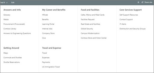
1. Keep the layout simple and clean
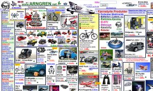
Simple and clean is the basic rule for a good user experience. An intranet homepage should not be overcrowded with web parts and elements. Without prioritization of key information, your intranet homepage can become confusing and chaotic, which prevents your employees from navigating further into the site.
Less is more. A clean layout makes it easier for users to focus on the most important content. So be selective with what you choose to put on your intranet homepage and keep the key information at the top of the page.
Besides, a clean and simple design is timeless. Your intranet will never look outdated.
2. Make the navigation easy to follow
Your intranet homepage needs to have an easy and clear navigation menu. It lets users quickly identify where they need to go and easily access the content they want without hurdles.
Try to avoid an overloaded menu which can cause your employees to get disoriented. They should be able to perform simple tasks easily. It’s enough to have 5 – 7 top menu items, according to the experts. If your organization has lots of information, data and links to share on the intranet, you can break it down into sections using a dropdown menu or a mega menu*.
*Mega menu: a large panel that drops down from a navigation menu, offering a whole array of options.
3. Provide targeted content
Receiving too much irrelevant information is as frustrating as having too little information. If you want to improve user engagement, make sure that your intranet homepage shows relevant content to users.
For example, Involv’s target audience feature enables you to show the right content to people in a specific location, team, or department.
4. Make it look good on mobile devices
As more and more employees work remotely, they need to be able to access the intranet on their mobile devices. Does your intranet have a mobile responsive design? That’s good but your employees will find it even more convenient and faster to access the intranet via an intranet mobile app. A mobile app resizes and pulls information in a consumable format for mobile devices.
Involv has a brandable mobile app which is available for Android and Apple devices. Take a look at the Involv mobile app brochure to discover how the app looks like.

Planning your intranet project
Planning a new intranet project? What steps to take to build an effective intranet? Download our free whitepaper.
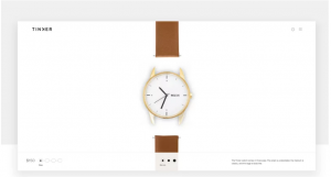
5. Use visual content
Pictures (not text) are magnets for attention. So an intranet homepage should not be too text-heavy. Use visual elements like images or videos on your homepage to capture user attention and engagement. For high-quality images, try sites like Unsplash, Freepik, or Pixabay. They are free to use.
Not only the homepage but any intranet content should be visual and interactive. According to Forrester Research, people are 75% more likely to watch a video than reading text. If you want to make your communication more engaging, try to use different types of content like videos, pictures, infographics, maps, etc.
6. Use your brand color and logo
To provide corporate identity an intranet homepage usually reflects the culture and brand. It can help employees to easily get familiar with the look and feel of the intranet.
Don’t just stop at the homepage. Use the brand color palette consistently throughout the intranet to maintain a consistent look for your intranet.
7. Don’t be afraid of white space.
White space is simply empty space on a page. In design, white space plays an important role and serves a purpose for both aesthetics and user-experience. Think of it as breathing room. If done well, white space helps direct users’ focus to specific areas. It also makes your intranet cleaner and tidier.
Check for yourself what gets your attention in the images below:
Conclusion:
The intranet homepage is a vital part of your intranet. It is worth investing time and resources to have a compelling, engaging, and effective design. Consider the seven best practices above when designing your homepage because they can mean the difference between adoption and abandonment.
If you need help to (re) design your intranet, don’t hesitate to contact one of our intranet experts. We’re very happy to help. Also, download our Involv lookbook to get inspired with 11 Involv intranet hompepage examples.

Tim Bogemans
Try it out today
01.
start your demo
Request your personal demo with our intranet expert and discuss how Involv can help you reach your organizational goals.
02.
enroll
Like what you see? Setup your ready-to-go digital workplace in less than 1 hour, without any technical knowledge.
03.
success
Employees will love what they see, as Involv integrates with all the tools they already know and use. Need more? Contact us!